DUTCH Test Enhancements
Hilary Miller, ND
DUTCH Test Enhancements
by Hilary Miller, ND
Visual representation plays an important role in conveying complex information on DUTCH reports. As we strive for continuous improvement and clarity in our reports, we are excited to announce some enhancements to the DUTCH report, aimed at improving readability and providing deeper insights into the data.
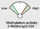
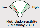
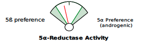
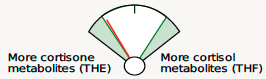
Beginning May 2, 2024, you will see several new features on the DUTCH Test. First, we are moving from our current “fan gauges” to a “slider” graphic. This will apply to all ratios currently represented as fan gauges: The estrogen methylation activity gauge, the 5a-reductase activity gauge, and the cortisone versus cortisol metabolites gauge.

↓

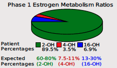
We are also adding key updates to our phase I estrogen metabolism report. When the DUTCH Test was launched over 10 years ago, the pie chart was a staple in illustrating the relative percentages of the three major phase 1 metabolites. Since that time, however, the research world has provided more information about these metabolites and the ratios of each compared to each other.
For example, the more accurate testing method using LC-MS/MS instruments (the method we use at DUTCH) has gained preference in estrogen metabolism research(1). In addition, the number of studies using 2OH:4OH and 2OH:16OH has increased. Assessing the prevalence of healthy 2OH metabolism by comparing it to one of the two other major metabolites has emerged as a clear way of assessing the potential negative impact that estrogen metabolism has on cells.


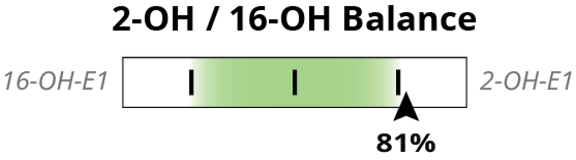
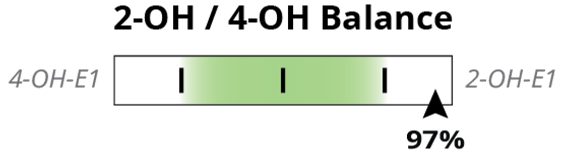
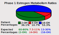
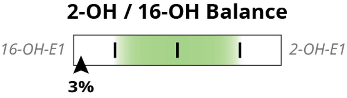
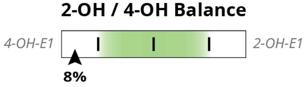
The pie chart above, which will remain on the report, shows the relative ratios of 2-OH-E1, 4-OH-E1, and 16-OH-E1 as a percentage of the total. To enhance our reading of phase I metabolism and follow the research, we are introducing the 2OH:4OH ratio and the 2OH:16OH ratio as sliders (left) on the report.

The 2-OH-E1 is the healthy pathway (shown in green on the pie chart above). In studies on estrogen metabolism ratios, women who metabolize most of their estrogens into 2-OH-E1 have lower long-term health risks than women who excrete more 4-OH-E1 and 16-OH-E1. This metabolite has low-to-no estrogen receptor affinity, it is anticarcinogenic and anti-proliferative.
Conversely, the 4-OH-E1 metabolite (shown in red on the pie chart above) is genotoxic, demonstrating a high ability to produce reactive oxygen species, bind to DNA in estrogen-sensitive tissues, and cause DNA damage. Finally, the 16-OH-E1 (shown in blue on the pie chart above) has a high affinity for the estrogen receptors, promoting continued estrogenic activity in estrogen-sensitive cells. The 16-OH-E1 has also been found to be inflammatory, and proliferative, and is possibly linked to auto-immune disease.
The following are some associations found with metabolite ratios:
A high 2OH:16OH or a high 2OH:4OH ratio is associated with (1-8):
- Reduced breast cancer (BC) risk
- Reduced BC mortality
- Reduced all-cause mortality in BC patients
- Reduced cardiovascular disease (CVD) mortality
A low 2:OH:16OH ratio is associated with (1, 2, 4-11):
- Increased BC risk
- Increased BC mortality
- Increased all-cause mortality
- Increased Systemic lupus erythematosus and rheumatoid arthritis
- Increased all-cause mortality
- Increased CVD mortality
A low 2OH:4OH ratio is associated with (3, 12-15):
- Increased DNA damage and DNA adduct formation
- Increased reactive oxygen species (ROS) in estrogen sensitive tissue
- Increased BC risk
The flagship DUTCH report included the pie chart as an excellent way to visualize these three metabolites and find approaches to optimize Phase I estrogen metabolism. In the below example, you can see clearly this patient dominates in the healthy 2-OH-E1 pathway.

The decision to incorporate these ratios separately stems from our commitment to providing comprehensive insights into hormones and metabolism. A key insight into phase I estrogen metabolism is that the 2-OH-E1 metabolite is safe while the 4-OH-E1 and the 16-OH-E1 have potentially detrimental effects, as described above. Therefore, comparing each metabolite separately to the 2-OH-E1 helps to understand its counterbalancing beneficial potential on the “bad” metabolites.
As an example, in certain cases such as when the 16-OH-E1 metabolite is significantly higher, it can overshadow a relatively high 4-OH-E1, potentially leading to a missed insight. In the example given, the pie chart reveals that 4-OH-E1 is in range, when compared to both 2- and 16-OH-E1, and while this is true, the 2OH:4OH slider reveals that there is not adequate 2:OH:E1 to counterbalance the negative effects of both 4 and 16.


View these visual updates in a sample DUTCH report from a 62-year-old male or a 44-year-old female . If you have questions about these updates, visit our FAQ section at the bottom of this post.
How to Interpret the New Metabolite Ratios
To interpret the result, first we notice what the ratio is and what type of result is ideal. In both ratios, the 2OH is the numerator, which means a higher result indicates more 2OH or healthier metabolism. In both ratios a lower result means more 4- or 16-OH.
Research studies compare relative levels within a population. Therefore, the sliders show the patient’s result as a population percentile. The concept is very similar to a reference range: As the patient’s ratio gets higher, their percentile is also higher. It is like transforming a reference range into a scale of zero to 100. The percentile and reference range are calculated according to CLIA guidelines by using our consistent testing methods and reviewing thousands of patient results. The population percentile is plotted on the slider low to high, from left to right, evenly across the slider. The patient’s result is shown with a black arrow and their percentile is listed. Let’s look at some examples:


Above, we see the 2OH/4OH ratio is at the 97th percentile. This means that the patient’s result is higher than 96% of the population. Since the 2OH is the numerator in the ratio, a high result indicates higher relative 2OH, which is good. Similarly, the 2OH/16OH ratio is high at the 81st percentile, indicating that 2OH is very dominant for this patient. The pie chart, mostly green representing 2OH, makes this easy to visualize for all three metabolites.


Above, we have a different situation. The 2OH/4OH is the 8th percentile, or only higher than the lowest 7% of the population. The 2OH/16OH is also low, at the 3rd percentile. The importance of looking at these ratios separately is well reflected in this example because, while the pie chart clearly shows a lot of blue, representing high 16OH, the relative excess of 4OH due to low 2OH is not as obvious until the ratios are viewed separately.
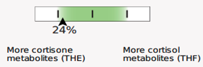
The slider graphic is new and its use in Phase 1 estrogen metabolism is not the only spot it is featured. You will see the sliders replacing our current “fan gauges” as well as described above. Let’s review how to read them.

↓

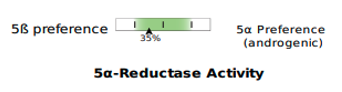
The examples demonstrate the current “fan gauge” next to the up-and-coming slider. The red needle on the fan gauge is replaced with a black arrow, and the gauge is essentially flattened and stretched out. The transition from a needle on the fan gauge to an arrow on a slider maintains the directions reading from left to right, consistent with our current fan gauge.
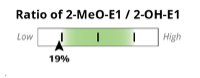
In the methylation example above, the red needle is just below the range on the fan gauge and on the slider, both to the left side of the graphic. We have added the population percentile of their result, in this example, 19th percentile. This means that this patient has more relative 2-Methoxy to 2-OH than 18% of the population. This is considered “low” or “slow” methylation. The percentage shown on the slider is the population percentile, not a percentage of one metabolite in total. We feel this adds information that was previously not specified, although this is not new: DUTCH has always used the population percentile to mark the patient results on the fan gauges.
A major difference is that the green part of the slider represents the “normal” range and the white now represents the normal population range. However, the placement on the slider is the same. A result that is close to the center represents more balance. The edges or sides represent more extreme metabolic preferences, with each side of the slider labeled for which metabolite dominates the ratio.
The new sliders will replace all the fan gauges on the report:
Phase II estrogen methylation activity


5a Reductase activity


Cortisone to cortisol metabolites ratio


The goal of these graphical updates is to maintain the ease of readability while adding valuable information to the DUTCH report. By providing a more granular view of the Phase I ratios and adopting intuitive graphics such as sliders, we hope to empower clinicians to extract deeper insights from the data and enhance clarity.
In conclusion, the introduction of new graphics and features represents our ongoing commitment to excellence in reporting. We are excited about these new enhancements to the report and look forward to continued feedback and engagement from our clients. Thank you for joining DUTCH in this improvement!
Become a DUTCH Provider to get access to comprehensive patient reports, expert clinical support, and validated and peer-reviewed research.
Frequently Asked Questions
When will I see the enhancements reflected on DUTCH reports?
Providers will begin seeing these visual updates reflected on reports starting May 2, 2024.
If my test is already in process, will the enhancements be reflected on my report?
Any reports that have not been released to you yet will show these updates.
Who can I contact for questions regarding these enhancements?
If you have questions, you can contact our Customer Care team by phone at 503-687-2050 or by email at .
References
1. Ziegler RG, et al. Epidemiologic studies of estrogen metabolism and breast cancer. Steroids. 2015;99:67-75.
2. Falk RT, et al. Relationship of serum estrogens and estrogen metabolites to postmenopausal breast cancer risk: a nested case-control study. Breast Cancer Res. 2013;15(2):R34.
3. Fuhrman BJ, et al. Estrogen metabolism and risk of breast cancer in postmenopausal women. J Natl Cancer Inst. 2012;104(4):326-339.
4. Im A, et al. Urinary estrogen metabolites in women at high risk for breast cancer. Carcinogenesis. 2009;30(9):1532-1535.
5. Moore SC, et al. Endogenous Estrogens, Estrogen Metabolites, and Breast Cancer Risk in Postmenopausal Chinese Women. J Natl Cancer Inst. 2016;108(10).
6. Ruan X, et al. The ratio of the estradiol metabolites 2-hydroxyestrone (2-OHE1) and 16α-hydroxyestrone (16-OHE1) may predict breast cancer risk in postmenopausal but not in premenopausal women: two case-control studies. Arch Gynecol Obstet. 2015;291(5):1141-1146.
7. Samavat H, Kurzer MS. Estrogen metabolism and breast cancer. Cancer Lett. 2015;356(2 Pt A):231-243.
8. Wang T, et al. Urinary Estrogen Metabolites and Long-Term Mortality Following Breast Cancer. JNCI Cancer Spectr. 2020;4(3):pkaa014.
9. Khan WA. 16 α-Hydroxyestrone induced adduct generate high affinity autoantibodies in SLE. Adv Med Sci. 2019;64(1):72-78.
10. Lahita RG, et al. Increased 16 alpha-hydroxylation of estradiol in systemic lupus erythematosus. J Clin Endocrinol Metab. 1981;53(1):174-178.
11. Weidler C, et al. Patients with rheumatoid arthritis and systemic lupus erythematosus have increased renal excretion of mitogenic estrogens in relation to endogenous antiestrogens. J Rheumatol. 2004;31(3):489-494.
12. Cavalieri EL, Rogan EG. Depurinating estrogen‐DNA adducts, generators of cancer initiation: their minimization leads to cancer prevention. Clinical and Translational Medicine. 2016;5(1):12.
13. Liehr JG, Ricci MJ. 4-Hydroxylation of estrogens as marker of human mammary tumors. Proceedings of the National Academy of Sciences. 1996;93(8):3294-3296.
14. Taioli E, et al. Comparison of estrogens and estrogen metabolites in human breast tissue and urine. Reprod Biol Endocrinol. 2010;8(1):93.
15. Zhu BT, Liehr JG. Inhibition of catechol O-methyltransferase-catalyzed O-methylation of 2- and 4-hydroxyestradiol by quercetin. Possible role in estradiol-induced tumorigenesis. J Biol Chem. 1996;271(3):1357-1363.
TAGS
Estrogen and Progesterone
Women's Health
Men's Health
Estrogen
Estrogen Detoxification